top of page
Iowa Hawkeyes
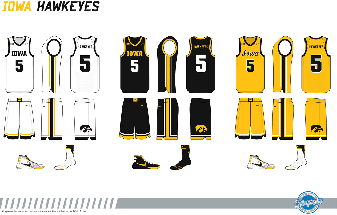
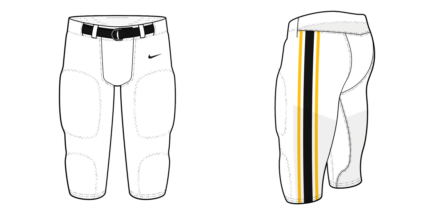
Iowa wanted to look like winners back in the 70's. So they looked to the Pittsburgh Steelers. But it's not the 1970's anymore. So now it's time for a new look for Iowa athletics. Iowa's redesign stays rooted in tradition while introducing subtle, fresh elements across all sports. Football keeps the helmet largely the same with a new stripe and a repositioned America Needs Farmers sticker. The jerseys feature NW stripes on the sleeves, a one-color wordmark, and matching pant stripes. The alternate flips the colors of the home/away jerseys and adds the Iowa script with a gold facemask. Hockey keeps a classic look with sleeve and hem stripes, featuring the Tiger-Hawk logo on the chest, and the alternate moves the logo to the shoulders. Baseball’s v-neck jerseys retain the Iowa script with a tail for baseball and NW stripes around the collar and sleeves, with the ANF logo on the upper back. The pants and socks mirror the football stripes. Basketball’s updates are minimal, with single-color striping around the neck and arms and an NW stripe down the right side that aligns with the shorts, where the stripes wrap around the bottom. The alternate uses the Iowa script instead of the wordmarks, following the uniform theme..
uniform picker
bottom of page


