top of page
This is a space to welcome visitors to the site. Grab their attention with copy that clearly states what the site is about, and add an engaging image or video.

Oregon Ducks


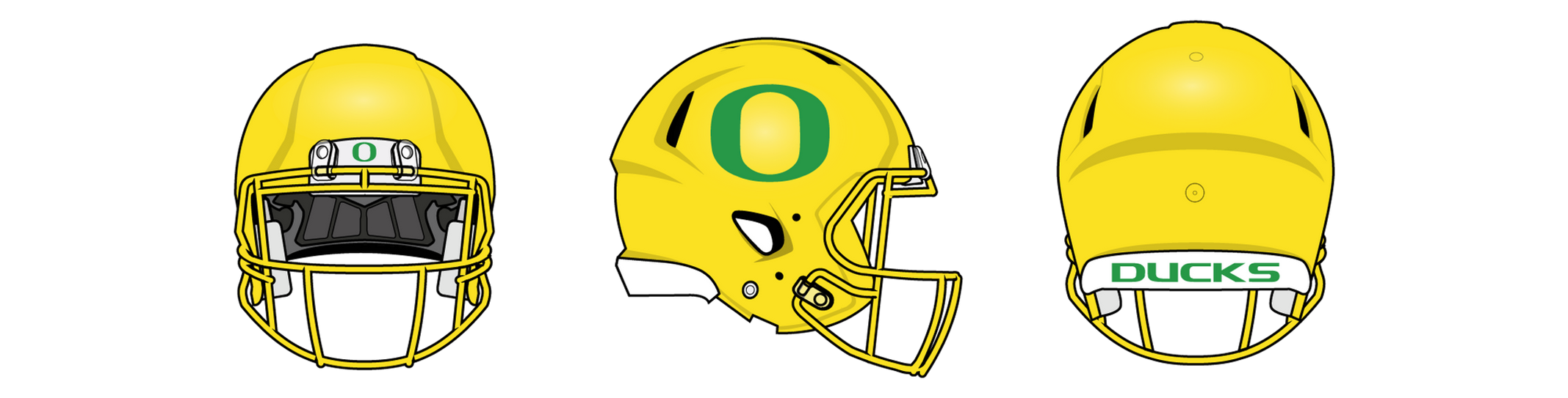
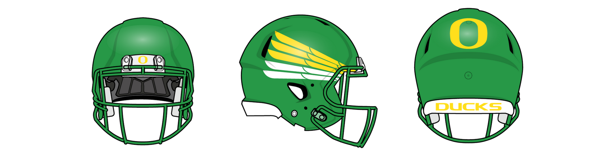
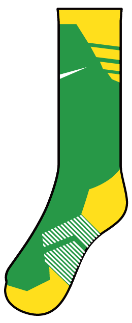
The Godfathers of college football uniforms. I felt that the Ducks' uniform evolution hit its peak with the Alamo Bowl's "sharper" wings, which I believe were criminally underused before the team went through a series of identity shifts. From the Lewis and Clark-themed helmets to the "blue collar" look, things got mismatched and lacked cohesion. For football, I kept the O and wings on both helmets, regardless of color, avoiding the mismatched sides look. The jerseys feature thinned-out, angled wings and the Autzen font. Pants have the wings at the bottom and the O on the hip. For hockey, I maintained the strong look with sublimated wings on the shoulders, similar to the Rose Bowl uniforms, and added stripes and Puddles on the pants. Baseball stayed largely the same, adding sublimated wings to the shoulders on the home and away jerseys and using wings as the focal point on the alternate. Hats/helmets feature the O or Puddles, with stripes on the pants. Basketball has wings on the shoulders and bottom of the shorts, with "DUCKS" on the home and "OREGON" on the away jerseys. The alternate features "FIGHTING DUCKS" on the yellow jersey.
uniform picker


bottom of page